
Your choice of colours for a room is not just a reflection of your preferred style. Colour grounds the visual identity of a room, enhancing the elements within that space, and affecting the mood of the people that use it.
In this guide, we will help you choose the best colour scheme for every room in your home.
Bathrooms
(Source: vivavida.nl)
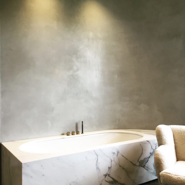
Bright whites and cool greys are reliable choices for your bathroom. White has forever been associated with cleanliness, and it is important that a bathroom projects this feeling.
Grey is a neutral colour that can be soothing and sophisticated, particularly when paired with white, making luxurious baths feel even classier and more rejuvenating.
(Source: Pinterest)
Metallic touches and calm colours like blue are fine additions to your bathroom palette. Deeply saturated walls and chrome decorative accents can contrast well with white fixtures like your sink and bathtub. Working with a natural material like tadelakt can create an extremely luxurious and exotic feel to your bathroom and will work with literally any colour palette.
Bedrooms
(Source: Pinterest)
Attaining a sense of restfulness in the bedroom can be done with soft off-whites and warm hues. Instead of the severely brilliant whites often found in bathrooms and living rooms, off-whites are easier on the eyes. Light aquatic blues and organic greens produce a serene atmosphere, which is perfect for inducing sleep.
(Source: Insight Decor)
The bedroom can also be a place of intimacy. Cosy pinks, lilacs, and lavenders create an air of comfort while also adding a hint of romance. Juxtaposed with rich, dark colours, your bedroom can feel an even more intimate place.
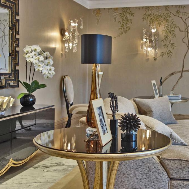
Living Rooms
(Source: ComfyDwelling.com)
Living rooms serve the double purposes of hosting high-energy activities and providing a relaxing space for lounging around. Bold colours like red, yellow, and orange make strong impressions and stimulate socialising. Choosing darker shades tend to draw out a dramatic look, especially in the evening light, while brighter tones radiate playfulness.
(Source: Wood Tailors Club)
For a more laid-back setting to your living room, earthy colours work better. Muted greens and neutrals make it easy for you, your family, and your guests to unwind. Pieces of nature such as plants and flowers add another layer of tranquillity.
Dining Rooms
(Source: Interior God)
Your dining room can be a comfy retreat for you and your loved ones or a lively location for entertaining company. Light, cheery yellows make for a vibrant ambience for conversations over meals. Vivid reds are another great choice for livening up dinner parties with family and friends.
(Source: Home Bunch)
Wooden furniture and subdued greens give off a rustic vibe, which is perfect if you want a homey feel to your dining room. Dining rooms in open spaces are fashionable but require contrasting either a majority white space with coloured accents or vice versa to tie every element together.
Kitchens
(Source: Sortra)
The kitchen is the busiest place in the typical home. It only makes sense that its colours should match the activity inherent to the space. Yellow is an obvious choice to help sustain the energy a cook needs in the kitchen. If you want to offset the potentially stressful dish preparation process, green is a good alternative.
(Source: MyRemodel)
Marble countertops and finished wood furniture are popular in kitchens, and their glossy classiness can be complemented with deep, dark hues or light, breezy whites.
Hallways
Hallways are the portals to the various spaces in your home. They are most likely the first impression guests have when they step into your house. Hallways evoke potential.
(Source: Lighting Stores)
Painting the walls of your hallways a fresh white have an expanding effect. Decorating them with artwork vitalises the stark monotony and introduces visitors to your personal style. Yellow can achieve a similar vibe with its welcoming warmth.
(Source: Planete Deco)
You may also choose bold colours in hallways leading to softer and lighter rooms for a striking contrast as people transition from one space to another.
Studies
(Source: 1stdibs.com)
Whether it’s for getting important work done or leisurely enjoying a good book, the study is the one place at home where you can concentrate in peaceful solitude. Simple, clean whites, creams or greys accomplish a no-fuss, minimalistic aesthetic to reduce distractions. Furnishing the room with woodwork can also keep it from feeling sterile.
(Source: Brayer Design)
The opposite direction can be taken by maximising the presence of wood furniture. Adorn the study with shelves lined with books, alongside beautiful cabinetry, to inspire creativity. Such embellishments also go well with deep, rich colours.
Exteriors
The outside of your home deserves as much care and attention in planning its colour scheme. From your front porch to your backyard patio, the hues you choose highlight the strengths of your exterior design.
(Source: Dulux)
Effortless elegance can be executed by taking inspiration from your property’s surroundings. Subdued blues and greys that match the sky maintain their appeal all year round. Soft greens blend well with lush gardens.
Meanwhile, contrast is another path worth pursuing, as brightly coloured furniture pop with personality in natural environments.
(Source: Studio Monroe)
Pastel paints on gates and doorways are inviting sights and makes coming home even more of a welcome delight.
Coordinate Your Home’s Colours
Colour dictates the overall mood of every single part of your house. Consider how you want each room to feel before deciding on a palette. Remember that you are not beholden to strictly follow interior design guidelines, as ultimately, it is up to your tastes and your personality. Feel free to inject your sense of style to make your home express the unique shade of you.